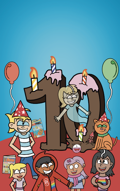
For DGmag's 10th anniversary, it was vital that I managed to get the cover and design of the comic, to match in unison with each other. This can be seen with The Beano's 2016 design onwards, the cover perfectly matches the design of the inside of The Beano. Therefore, The DGmag needs to be consistent with it's overall design and layout.
But finding that perfect cover design was a tad tricky. I wanted an idea of the new circle logo being kept in the left hand corner thus allowing the overall cover image to wrap itself around the rest of the remaining area. This was an idea I liked from the new Doctor Who Magazine cover which perfectly allows the new diamond 2023 logo to breathe without getting in the way of the rest of the cover. Therefore, DGmag would need to do something similar as the primary version on the cover is indeed, the circle stacked logo.
Shown above, we have the cover mock-up image, which was tweaked for the final version. Here, Candi's arms looked a bit odd as well as Jone the Bouncy Ball being present on the cover (now Jon again). I also went with using the updated Dom and Ginger design in the final cover as they have indeed, had a style update since last year's editions. Aside from that, not much else has been amended apart from the colour going to a more darker shade of blue..
Below, are the reject covers that never made it to the final version. You will notice that not much was changed in terms of the overall composition of the cover.
IDEA 1Although this looks not too dissimilar to the official cover, you will notice the white masthead is missing, as well as the website link not being all in bold text. The comic strip advertisements, are also in white text and not yellow.On this version, the cover is a bit more stripped back, and would still use the DG colour scheme idea in a swirl around the logo. (In the 2020-22 revamp, it was as the masthead itself). As this was too alike the previous logo idea, I removed it for further editing to the cover.
IDEA 3
This cover is a very minimised idea, with not much on the cover at all in terms of adverts or clutter. While this does make the cover look tidier, it still needed a bit more on the cover to suit the new redesign's style.
IDEA 1.2
This is basically idea 1, without the colour swirl around the logo.
IDEA 4
The masthead idea is in place. However, the yellow part at the top is not. Also, the Dom emoji is not yet present, so a stand in one was used (an old one I had made in PowerPoint). Notice that the comic strip advertisements do not as of yet have my font used, so the normal default PowerPoint font was still present to advertise Bad Babies and Little Rude Riding Hood's strips.
IDEA 5
One that was very nearly used, the DG colour scheme was made to begin in the masthead, and bleed out into the cover's background. This idea would be present in all the issues afterwards to. Note that the 'It's our 10th Anniversary Special readers!' quote, was placed at the top of the page too. It was only after some emending, that I decided on it being placed at the bottom of the image instead.
To finish this blog, I have attached two mock-up pages for the comic strip layout. One idea, was to have the strips filling up the majority of the page, so no yellow or orange banners would be present. As I liked the idea of having yellow for Dom, and orange for Ginger being a feature for these pages, I decided to reuse the idea from the 2020 revamp, but instead redesigned the page, so that the black lines on the banners were removed as well as the colours being brightened up too.


No comments:
Post a Comment